For most guests, the first encounter with an event is a link preview: a title, an image and a line of text embedded in a messenger chat or LinkedIn feed. Before they read the agenda, location or price, these three elements have already shaped their impression. Does the invitation look worth their attention, or does it feel like another mass email?
Yet in many teams, event branding comes last. The name comes from a project folder, the logo gets dropped into the next template, and the cover image is whatever happens to be available in the media library. Without an in-house design team, that is understandable, but avoidable. With a clear process, you can build a consistent event identity in half a day: name, tagline, visual style and a coherent experience at every guest touchpoint.
The name: search term first, wordplay second
A good event name needs to do three things: it must be easy to say, easy to write and easy to find. If people have to spell it out over the phone, you risk losing registrations before they even happen. Use this checklist to find the right event name:
- Pronunciation: Can people understand the name the first time they hear it?
- Searchability: Does searching for the name together with the city or topic bring up your event rather than someone else’s?
- Clarity: Does the name, or a subtitle, explain what the event is about? A creative title needs a subtitle that makes the topic clear.
- Availability: Are the domain, social media handles and hashtag available? For a recurring event series, an initial trademark search through the German Patent and Trade Mark Office (DPMA) or the EUIPO’s TMview database is also worth considering. This does not replace legal advice.
- Other languages: Does the word have an unintended meaning in another language? This matters especially when your audience is international.
AI helps you generate ideas, but it should not make the final decision. Give it a brief covering your audience, tone, occasion, location and duration. Within minutes, you can generate dozens of naming ideas, grouped by style: factual, playful, location-based or compound names.
Your team makes the final selection using the checklist. Read two or three favourites aloud in an invitation sentence: “We’d like to invite you to …” If it sounds awkward, remove it from the shortlist.
The tagline: one sentence from the guest’s perspective
An event tagline should not explain what your company wants to say. It should communicate what guests will take away from the event. A useful approach connects the target audience with a concrete outcome, for example: “An afternoon that turns suppliers into trusted contacts.”
Generic phrases such as “Connect, learn, get inspired” could describe almost any event, which means they do little to distinguish yours. Try this simple test: could another organiser use the same sentence without changing a word? If so, it is too generic.
AI can provide the raw material. Ask for five options in each of three tones: straightforward, warm and punchy. Set clear boundaries: no more than eight words, no jargon and at least one concrete noun. Then your team takes over, using its knowledge of the audience to sharpen the wording. An event aimed at procurement managers needs a different tagline from one aimed at founders.
The look: three rules instead of a style guide
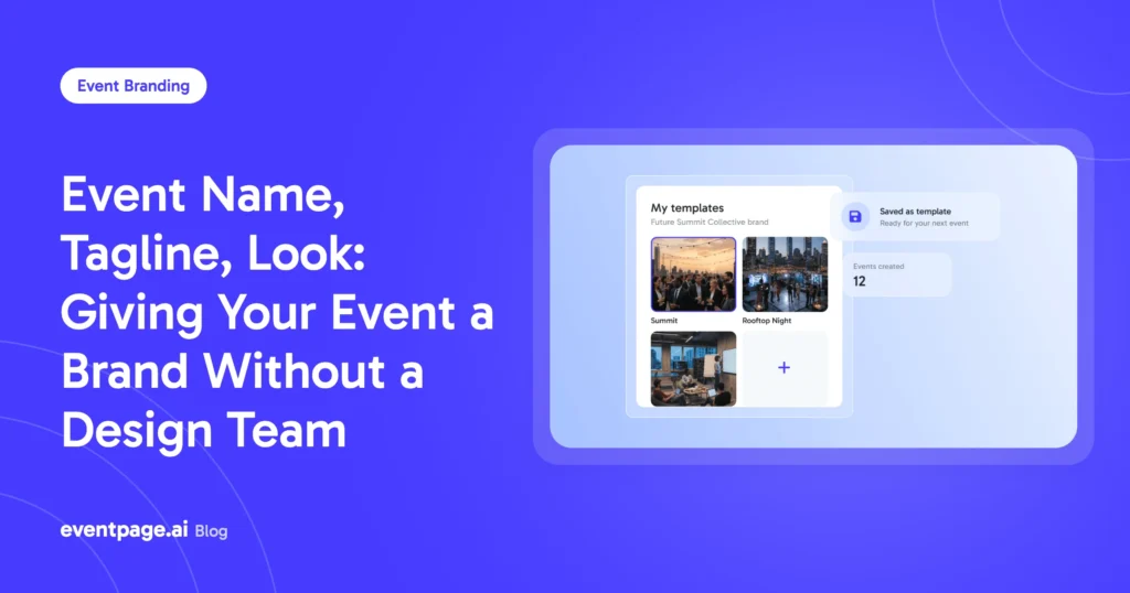
Your event does not need a forty-page style guide. Three clear design decisions are enough, as long as everyone on the team can apply them without asking for clarification. Together, they create a recognisable event key visual and a consistent event visual identity.
- Colours: Choose a primary colour from your company’s existing brand identity and an accent colour reserved for event elements such as buttons and dates. Check contrast carefully, especially when text appears on images.
- Typography: Use one typeface in two weights or styles: one for headings and one for body text. If your company already has a brand typeface, use it.
- Motif: Choose a recurring visual element, such as a detail from the venue, a pattern or a shape. It should remain recognisable even in a small link preview.
The Open Graph protocol also matters when creating a cover image. It allows platforms to retrieve information such as a preview image from a webpage. However, each platform decides how that image is cropped. Keep important text away from the edges and choose a visual that works even without a caption.
When choosing image sources, real photos of the venue or previous editions are usually more convincing than generic stock imagery. If you use AI-generated images, do not present fictional people as real guests, and label AI-generated people accordingly.
One identity, ten touchpoints
Event branding rarely fails because of the cover image alone. More often, it breaks down at the touchpoints that follow. Guests encounter your event in several places:
- Invitation email
- Link preview
- Event page
- Registration form
- Confirmation email
- Reminder email
- Ticket or wallet pass
- Check-in
- Name badge
- Thank-you email
Map this journey once and check every touchpoint against the same questions:
- Is the event name spelled consistently everywhere?
- Is the sender recognisable, or does the email come from an unfamiliar domain?
- Do the colours, typography and logo match?
- Does the tone of standard messages, such as automated confirmations, fit the event?
Pay particular attention to touchpoints generated by different tools: confirmation emails with another company’s logo, tickets with a different layout or messages from an impersonal sender address. Every inconsistency can undermine trust. This is especially problematic just before the event, when guests are looking for their tickets or important information.
Three mistakes that keep happening
1. Finalising the name too early
The event name is approved before it has been properly checked. Once the first invitation has been sent, changing it can damage credibility. That is why the naming checklist belongs before approval, not after it.
2. Designing for a large screen instead of the real context
Your design needs to work where guests actually see it: on a smartphone, in a narrow preview and often when they are short on time. If a design looks great on the marketing team’s screen but turns into a grey block in a chat preview, it has missed its purpose. Test every draft in its actual context by sending yourself the link through a messenger app.
3. Letting everyone change the design
One person replaces the image, another shortens the title, and a third introduces a new font. Three weeks later, the event page and invitation look as if they belong to different events. Assign one person approval rights for the name, tagline and visual style, and maintain a single source from which all touchpoints get their design elements.
Where eventpage.ai fits in
eventpage.ai is an AI event manager for people who need to organise an event without being event professionals themselves. A short briefing generates a draft event page that you can customise in the editor and with more than 100 templates.
You can add your own domain, sender, logo and colours so the event page, invitation and confirmation share the same look. Tickets and RSVPs are available as PDFs with category and seat details, as well as wallet passes. Name badges can be printed using the badge-printing module. Hosting is based in Germany, and a data processing agreement under Article 28 of the GDPR is available.
One point remains important: the AI-generated draft is a proposal. Your team makes the final decisions about the name, tagline and imagery.
An AI brief you can copy
The more specific your briefing, the fewer revision rounds you will need. These details are enough to get started:
- Occasion and format: What are you celebrating, presenting or discussing? How long will the event last, and where will it take place?
- Guests: Who is attending, what does this group expect, and how should you address them?
- Tone: Three adjectives describing the desired tone, plus two words that should not appear.
- Takeaway: What should guests be able to do, know or take away after the event?
- Requested output: 25 name ideas, five taglines for each favourite, and a cover-image description specifying the motif and colours, without people.
Sort the results, shorten them and check them against your criteria. This can turn the initial brainstorming round into an hour of work instead of a full-day workshop.
Conclusion and next step
One name, one sentence, one visual identity. Define these three elements before sending the first invitation, and you will avoid unnecessary revisions across your event page, emails and tickets. The goal is not just a strong key visual, but a consistent identity throughout the entire event journey.
With eventpage.ai, you can generate a draft event page from your briefing and customise it to match your brand.